Unsupervised Learning
Machine learning is the science and art of giving computers the ability to learn to make decisions from data without being explicitly programmed.
Unsupervised learning, in essence, is the machine learning task of uncovering hidden patterns and structures from unlabeled data. For example, a researcher might want to group their samples into distinct groups, based on their gene expression data without in advance what these categories maybe. This is known as clustering, one branch of unsupervised learning.
Supervised learning (which will be addressed later in depth), is the branch of machine learning that involves predicting labels, such as whether a tumor will be benign or malignant.
Clustering
One popular technique in unsupervised learning is clustering. As the name itself suggests, Clustering algorithms group a set of data points into subsets or clusters. The algorithms’ goal is to create clusters that are coherent internally, but clearly different from each other externally. In other words, entities within a cluster should be as similar as possible and entities in one cluster should be as dissimilar as possible from entities in another.
Broadly speaking there are two ways of clustering data points based on the algorithmic structure and operation, namely agglomerative and divisive.
- Agglomerative: An agglomerative approach begins with each observation in a distinct (singleton) cluster, and successively merges clusters together until a stopping criterion is satisfied.
- Divisive: A divisive method begins with all patterns in a single cluster and performs splitting until a stopping criterion is met.
Essentially, this is the task of grouping your data points, based on something about them, such as closeness in space. Clustering is more of a tool to help you explore a dataset, and should not always be used as an automatic method to classify data. Hence, you may not always deploy a clustering algorithm for real-world production scenario. They are often too unreliable, and a single clustering alone will not be able to give you all the information you can extract from a dataset.
K-Means
What we are going to do is group the tumor data points into two clusters using an algorithm called k-means, which aims to cluster the data in order to minimize the variances of the clusters. The basic idea behind k-means clustering consists of defining clusters so that the total intra-cluster variation (known as total within-cluster variation) is minimized. There are several k-means algorithms available. However, the standard algorithm defines the total within-cluster variation as the sum of squared distances Euclidean distances between items and the corresponding centroid:
Let’s cluster our data points (ignoring their know classes) using k-means and then we’ll compare the results to the actual labels that we know:
set.seed(1)
km.out <- kmeans(breastCancerData[3:ncol(breastCancerData)], centers=2, nstart=20)
The nstart option attempts multiple initial configurations and reports on the best one within the kmeans function. Seeds allow us to create a starting point for randomly generated numbers, so that each time our code is run, the same answer is generated.
Also, note that k-means requires the number of clusters to be defined beforehand and given via the centers option.
Let’s check now what the output contains:
str(km.out)
The output will be:
List of 9
 $ cluster     : int [1:569] 2 2 2 1 2 1 2 1 1 1 ...
 $ centers     : num [1:2, 1:30] 12.6 19.4 18.6 21.7 81.1 ...
  ..- attr(*, "dimnames")=List of 2
  .. ..$ : chr [1:2] "1" "2"
  .. ..$ : chr [1:30] "Radius.Mean" "Texture.Mean" "Perimeter.Mean" "Area.Mean" ...
 $ totss       : num 2.57e+08
 $ withinss    : num [1:2] 28559677 49383423
 $ tot.withinss: num 77943100
 $ betweenss   : num 1.79e+08
 $ size        : int [1:2] 438 131
 $ iter        : int 1
 $ ifault      : int 0
 - attr(*, "class")= chr "kmeans"
The information contained here is:
$cluster: a vector of integers (from 1:k) indicating the cluster to which each point is allocated.$centers: a matrix of cluster centers.$withinss: vector of within-cluster sum of squares, one component per cluster.$tot.withinss: total within-cluster sum of squares (i.e.sum(withinss)).$size: the number of points in each cluster.
Let’s have a look at the clusters, and we will do this in relationship to the principal components we identified earlier:
ggplot(as.data.frame(ppv_pca$x), aes(x=PC1, y=PC2, color=as.factor(km.out$cluster), shape = breastCancerData$Diagnosis)) +
  geom_point( alpha = 0.6, size = 3) +
  theme_minimal()+
  theme(legend.position = "bottom") +
  labs(title = "K-Means clusters against PCA", x = "PC1", y = "PC2", color = "Cluster", shape = "Diagnosis")
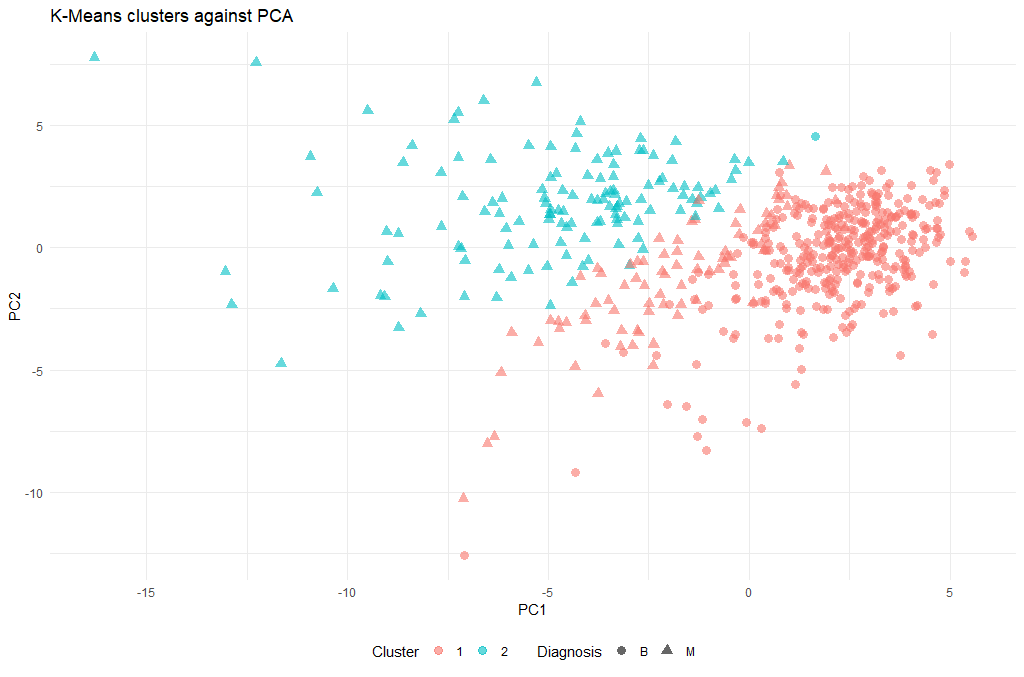
(There is a lot of information to unpack here, so we will discuss during the course what these 5 lines of code actually do)
Now that we have a cluster for each tumor (clusters 1 and 2), we can check how well they coincide with the labels that we know. To do this we will use a cool method called cross-tabulation: a cross-tab is a table that allows you to read off how many data points in clusters 1 and 2 were actually benign or malignant respectively.
# Cross-tab of clustering & known labels
library(gmodels)
CrossTable(breastCancerData$Diagnosis, km.out$cluster)
The output should look like this:
Cell Contents
|-------------------------|
|                       N |
| Chi-square contribution |
|           N / Row Total |
|           N / Col Total |
|         N / Table Total |
|-------------------------|


Total Observations in Table:  569


                           | km.out$cluster
breastCancerData$Diagnosis |         1 |         2 | Row Total |
---------------------------|-----------|-----------|-----------|
                         B |       356 |         1 |       357 |
                           |    23.988 |    80.204 |           |
                           |     0.997 |     0.003 |     0.627 |
                           |     0.813 |     0.008 |           |
                           |     0.626 |     0.002 |           |
---------------------------|-----------|-----------|-----------|
                         M |        82 |       130 |       212 |
                           |    40.395 |   135.060 |           |
                           |     0.387 |     0.613 |     0.373 |
                           |     0.187 |     0.992 |           |
                           |     0.144 |     0.228 |           |
---------------------------|-----------|-----------|-----------|
              Column Total |       438 |       131 |       569 |
                           |     0.770 |     0.230 |           |
---------------------------|-----------|-----------|-----------|
Question: How well did the clustering work?
Optimal k
One technique to choose the best k is called the elbow method. This method uses within-group homogeneity or within-group heterogeneity to evaluate the variability. In other words, you are interested in the percentage of the variance explained by each cluster. You can expect the variability to increase with the number of clusters, alternatively, heterogeneity decreases. Our challenge is to find the k that is beyond the diminishing returns. Adding a new cluster does not improve the variability in the data because very few information is left to explain.
First of all, let’s create a function that computes the total within clusters sum of squares:
kmean_withinss <- function(k) {
  cluster <- kmeans(breastCancerData[3:ncol(breastCancerData)], k)
  return (cluster$tot.withinss)
}
We can try for a single k (e.g. 2), and see the value:
kmean_withinss(2)
[1] 77943100
However, we need to test this n times. We will use the sapply() function to run the algorithm over a range of k. This technique is faster than creating a loop and store the value each time.
# Set maximum cluster
max_k <-20
# Run algorithm over a range of k
wss <- sapply(2:max_k, kmean_withinss)
Finally, let’s save the results into a data frame, so that we can work with it:
# Create a data frame to plot the graph
elbow <-data.frame(2:max_k, wss)
Now that we have the data, we can plot them and try to identify the “elbow” point:
# Plot the graph with gglop
ggplot(elbow, aes(x = X2.max_k, y = wss)) +
  geom_point() +
  geom_line() +
  scale_x_continuous(breaks = seq(1, 20, by = 1))
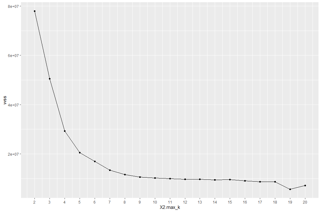
From the graph, you can see the optimal k is around 10, where the curve is starting to have a diminishing return.
| Exercises | |
|---|---|
| 1 | Try re-running the clustering step with the new k. Is there a significant difference? |
| 2 | Try to think of alternative metrics that could be used as a “distance” measure, instead of the default “Euclidean”. Do you think there might be an optimal for our case? |
Hierarchical clustering
k-means clustering requires us to specify the number of clusters, and determining the optimal number of clusters is often not trivial. Hierarchical clustering is an alternative approach which builds a hierarchy from the bottom-up, and doesn’t require us to specify the number of clusters beforehand but requires extra steps to extract final clusters. The algorithm works as follows:
- Put each data point in its own cluster.
- Identify the closest two clusters and combine them into one cluster.
- Repeat the above step till all the data points are in a single cluster.
Once this is done, it is usually represented by a dendrogram like structure. There are a few ways to determine how close two clusters are:
- Complete linkage clustering: Find the maximum possible distance between points belonging to two different clusters.
- Single linkage clustering: Find the minimum possible distance between points belonging to two different clusters.
- Mean linkage clustering: Find all possible pairwise distances for points belonging to two different clusters and then calculate the average.
- Centroid linkage clustering: Find the centroid of each cluster and calculate the distance between centroids of two clusters.
We will be applying Hierarchical clustering to our dataset, and see what the result might be. Remember that our dataset has some columns with nominal (categorical) values (columns ID and Diagnosis), so we will need to make sure we only use the columns with numerical values. There are no missing values in this dataset that we need to clean before clustering. But the scales of the features are different and we need to normalize it.
breastCancerDataScaled <- as.data.frame(scale(breastCancerData[3:ncol(breastCancerData)]))
summary(breastCancerDataScaled)
We can now proceed with creating the distance matrix:
dist_mat <- dist(breastCancerDataScaled, method = 'euclidean')
There are several options for method: euclidean, maximum, manhattan, canberra, binary or minkowski.
The next step is to actually perform the hierarchical clustering, which means that at this point we should decide which linkage method we want to use. We can try all kinds of linkage methods and later decide on which one performed better. Here we will proceed with average linkage method (i.e. UPGMA); other methods include ward.D, ward.D2, single, complete, mcquitty (= WPGMA), median (= WPGMC) and centroid (= UPGMC).
hclust_avg <- hclust(dist_mat, method = 'average')

plot(hclust_avg)
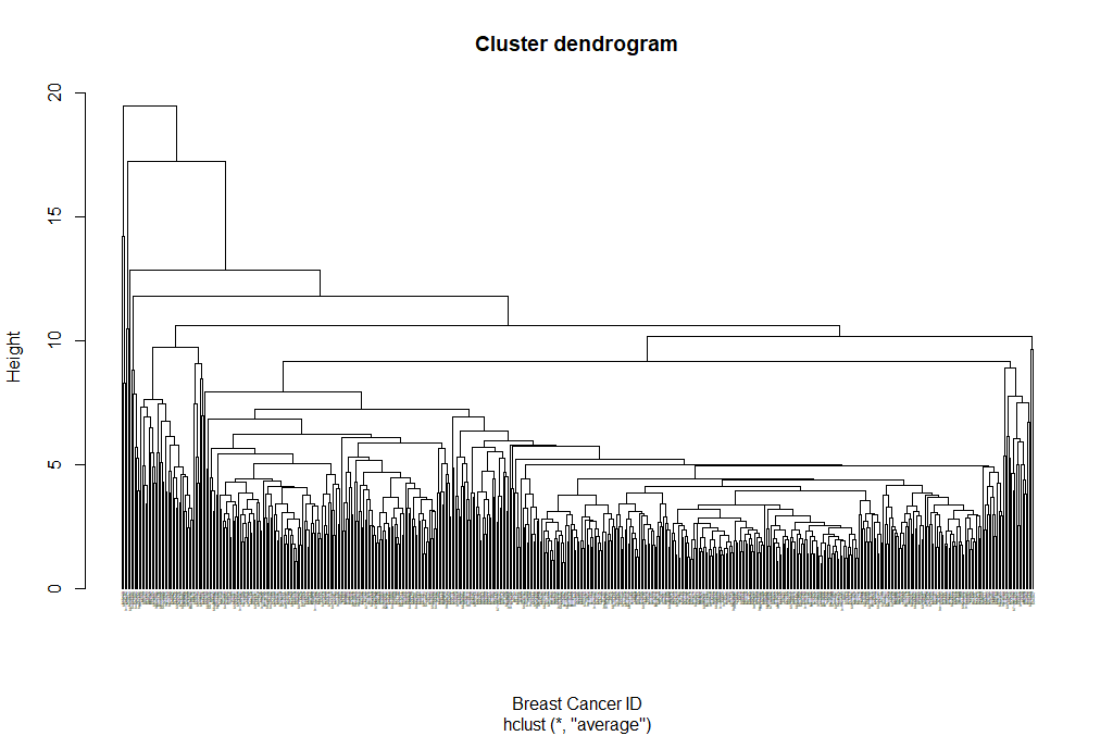
Notice how the dendrogram is built and every data point finally merges into a single cluster with the height(distance) shown on the y-axis.
Next, we can cut the dendrogram in order to create the desired number of clusters. In our case, we might want to check whether our two groups (M and B) can be identified as sub-trees of our clustering - so we’ll set k = 2 and then plot the result.
cut_avg <- cutree(hclust_avg, k = 2)

plot(hclust_avg, labels = breastCancerData$ID, hang = -1, cex = 0.2,
     main = "Cluster dendrogram (k = 2)", xlab = "Breast Cancer ID", ylab = "Height")
# k: Cut the dendrogram such that exactly k clusters are produced
# border: Vector with border colors for the rectangles. Coild also be a number vector 1:2
# which: A vector selecting the clusters around which a rectangle should be drawn (numbered from left to right)
rect.hclust(hclust_avg , k = 2, border = c("red","green"), which = c(1, 2))
# Draw a line at the height that the cut takes place
abline(h = 18, col = 'red', lwd=3, lty=2)
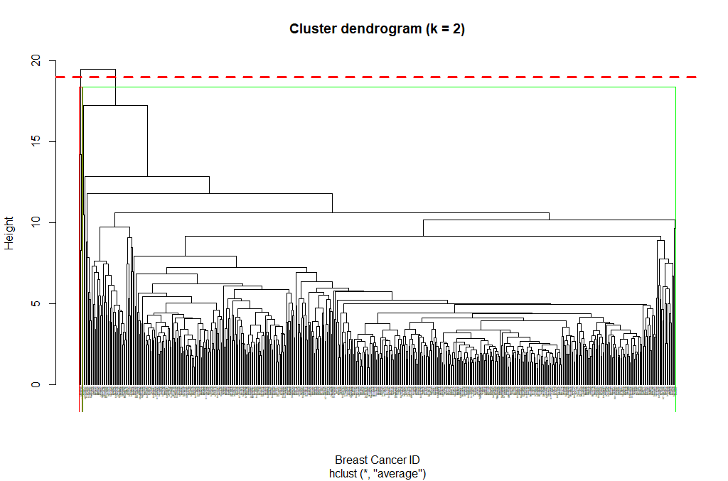
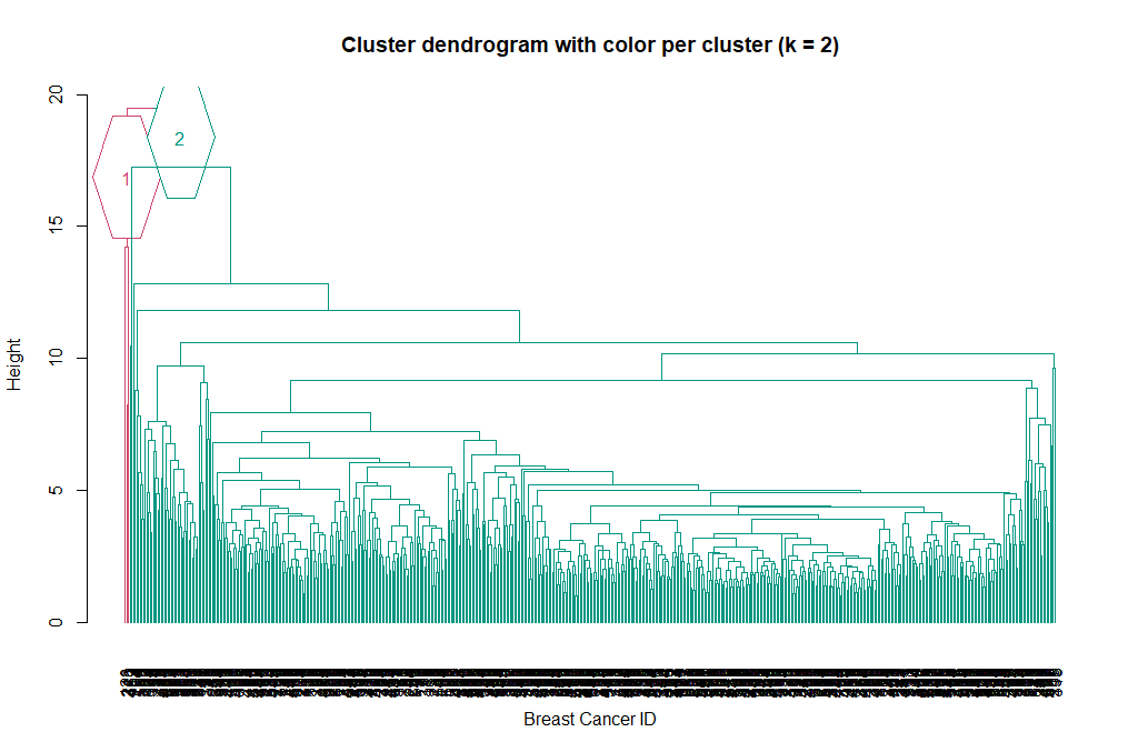
Now we can see the two clusters enclosed in two different colored boxes. We can also use the color_branches() function from the dendextend library to visualize our tree with different colored branches.
library(dendextend)
avg_dend_obj <- as.dendrogram(hclust_avg)
# We can use either k (number of clusters), or clusters (and specify the cluster type)
avg_col_dend <- color_branches(avg_dend_obj, k = 2, groupLabels=TRUE)
plot(avg_col_dend, main = "Cluster dendrogram with color per cluster (k = 2)", xlab = "Breast Cancer ID", ylab = "Height")
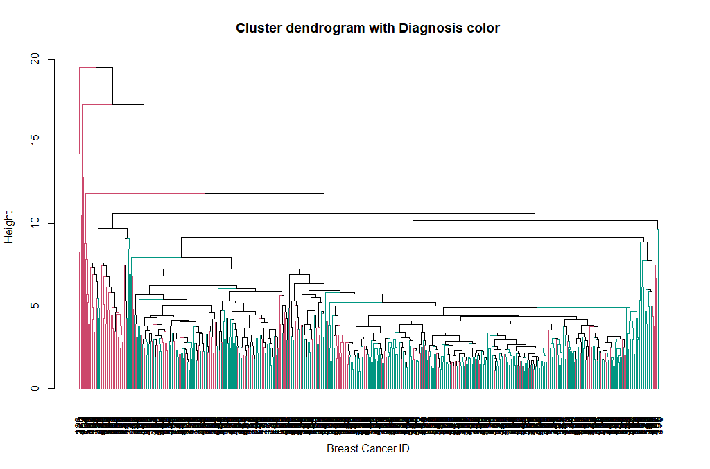
We can change the way branches are colored, to reflect the Diagnosis value:
avg_col_dend <- color_branches(avg_dend_obj, clusters = breastCancerData$Diagnosis)
plot(avg_col_dend, main = "Cluster dendrogram with Diagnosis color", xlab = "Breast Cancer ID", ylab = "Height")
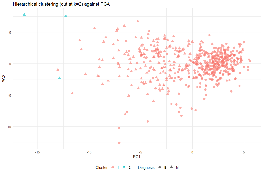
ggplot(as.data.frame(ppv_pca$x), aes(x=PC1, y=PC2, color=as.factor(cut_avg), shape = breastCancerData$Diagnosis)) +
  geom_point( alpha = 0.6, size = 3) +
  theme_minimal()+
  theme(legend.position = "bottom") +
  labs(title = "Hierarchical clustering (cut at k=2) against PCA", x = "PC1", y = "PC2", color = "Cluster", shape = "Diagnosis")
| Exercises | |
|---|---|
| 1 | The hierarchical clustering performed so far, only used two methods: euclidean and average. Try experimenting with different methods. Do the final results improve? |
| 2 | Obviously the cut-off selection (k=2) was not optimal. Try using different cut-offs to ensure that the final clustering could provide some context to the original question. |