Exploratory Data Analysis (EDA)
Table of Content
- Loading some data
- A first look at the data
- Another (messier) dataset
- Value transformation and variance stabilization
- Handling missing values
- Normalizing your data
- PCA
1. Loading some data
The data that we will be using for this workshop are from the following sources:
- The Breast Cancer Wisconsin (Diagnostic) Data Set from the UCI Machine Learning repository.
- RNA-Seq data from the study of tooth growth in mouse embryos from the Gene Expression Omnibus ID:GSE76316
We will first load up the UCI dataset. The dataset itself does not contain column names, we’ve created a second file with only the column names, which we will use. We will be using tidyverse, a collection of R packages for Data Science.
library(tidyverse) # working with data frames, plotting

breastCancerData <- read_csv("https://archive.ics.uci.edu/ml/machine-learning-databases/breast-cancer-wisconsin/wdbc.data",
               col_names = FALSE)

breastCancerDataColNames <- read_csv("https://raw.githubusercontent.com/BiodataAnalysisGroup/2021-11-ml-elixir-pt/main/data/wdbc.colnames.csv",
                                     col_names = FALSE)

colnames(breastCancerData) <- breastCancerDataColNames$X1

# Check out head of dataframe
breastCancerData %>% head()
If all goes well, we can see that our dataset contains 569 observations across 32 variables. This is what the first 6 lines look like:
# A tibble: 6 x 32
      ID Diagnosis Radius.Mean Texture.Mean Perimeter.Mean Area.Mean Smoothness.Mean
   <dbl> <chr>           <dbl>        <dbl>          <dbl>     <dbl>           <dbl>
1 8.42e5 M                18.0         10.4          123.      1001           0.118
2 8.43e5 M                20.6         17.8          133.      1326           0.0847
3 8.43e7 M                19.7         21.2          130       1203           0.110
4 8.43e7 M                11.4         20.4           77.6      386.          0.142
5 8.44e7 M                20.3         14.3          135.      1297           0.100
6 8.44e5 M                12.4         15.7           82.6      477.          0.128
# ... with 25 more variables: Compactness.Mean <dbl>, Concavity.Mean <dbl>,
#   Concave.Points.Mean <dbl>, Symmetry.Mean <dbl>, Fractal.Dimension.Mean <dbl>,
#   Radius.SE <dbl>, Texture.SE <dbl>, Perimeter.SE <dbl>, Area.SE <dbl>,
#   Smoothness.SE <dbl>, Compactness.SE <dbl>, Concavity.SE <dbl>, Concave.Points.SE <dbl>,
#   Symmetry.SE <dbl>, Fractal.Dimension.SE <dbl>, Radius.Worst <dbl>, Texture.Worst <dbl>,
#   Perimeter.Worst <dbl>, Area.Worst <dbl>, Smoothness.Worst <dbl>,
#   Compactness.Worst <dbl>, Concavity.Worst <dbl>, Concave.Points.Worst <dbl>,
#   Symmetry.Worst <dbl>, Fractal.Dimension.Worst <dbl>
We will also make our Diagnosis column a factor:
Question: What is a factor?
# Make Diagnosis a factor
breastCancerData$Diagnosis <- as.factor(breastCancerData$Diagnosis)
2. A first look at the data
Before thinking about modeling, have a look at your data. There is no point in throwing a 10000 layer convolutional neural network at your data before you even know what you’re dealing with.
We will first remove the first column, which is the unique identifier of each row:
Question: Why?
# Remove first column
breastCancerDataNoID <- breastCancerData[2:ncol(breastCancerData)]

# View head
breastCancerDataNoID %>% head()
The output should like like this:
# A tibble: 6 x 31
  Diagnosis Radius.Mean Texture.Mean Perimeter.Mean Area.Mean Smoothness.Mean
  <fct>           <dbl>        <dbl>          <dbl>     <dbl>           <dbl>
1 M                18.0         10.4          123.      1001           0.118
2 M                20.6         17.8          133.      1326           0.0847
3 M                19.7         21.2          130       1203           0.110
4 M                11.4         20.4           77.6      386.          0.142
5 M                20.3         14.3          135.      1297           0.100
6 M                12.4         15.7           82.6      477.          0.128
# ... with 25 more variables: Compactness.Mean <dbl>, Concavity.Mean <dbl>,
#   Concave.Points.Mean <dbl>, Symmetry.Mean <dbl>, Fractal.Dimension.Mean <dbl>,
#   Radius.SE <dbl>, Texture.SE <dbl>, Perimeter.SE <dbl>, Area.SE <dbl>,
#   Smoothness.SE <dbl>, Compactness.SE <dbl>, Concavity.SE <dbl>, Concave.Points.SE <dbl>,
#   Symmetry.SE <dbl>, Fractal.Dimension.SE <dbl>, Radius.Worst <dbl>, Texture.Worst <dbl>,
#   Perimeter.Worst <dbl>, Area.Worst <dbl>, Smoothness.Worst <dbl>,
#   Compactness.Worst <dbl>, Concavity.Worst <dbl>, Concave.Points.Worst <dbl>,
#   Symmetry.Worst <dbl>, Fractal.Dimension.Worst <dbl>
We have many variables in this dataset. For the interest of time, we will focus only on the first five. Let’s have a look at a plot:
library(GGally)

ggpairs(breastCancerDataNoID[1:5], aes(color=Diagnosis, alpha=0.4))
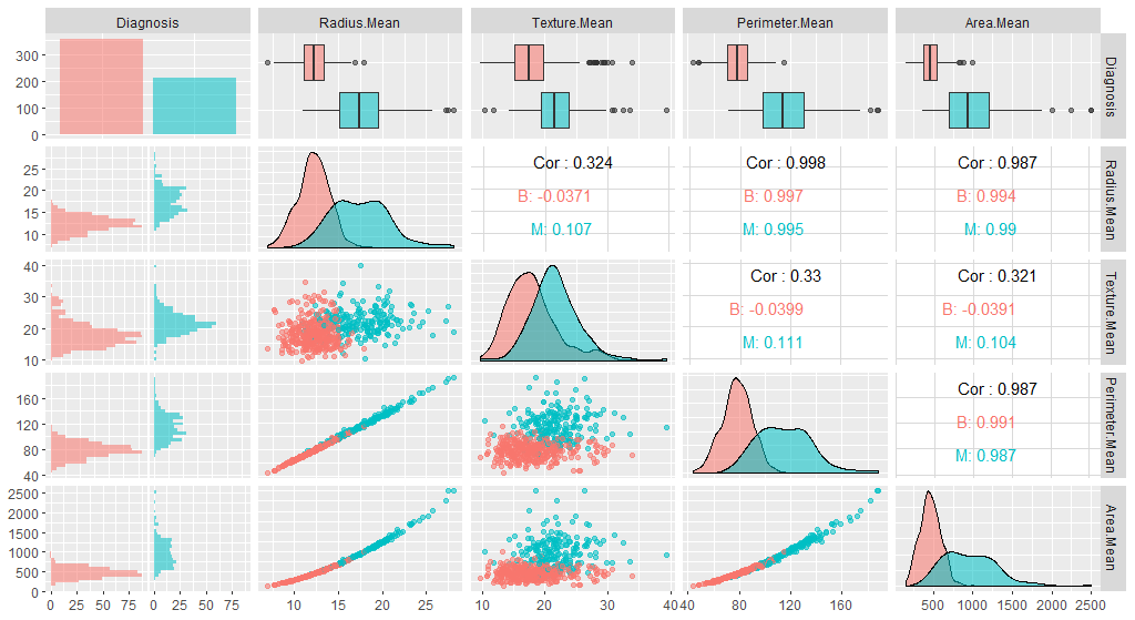
This view is very nice as it allows us to see many details about our different columns :
- how the datapoints are spread out (is the scale of the different variables the same?)
- how they relate to a variable of interest (here, cancer diagnosis)
- how the different columns correlate to one another
- …
Questions:
- From this graph, can you spot variables which could be useful to help predict cancer Diagnosis?
- Why could we be interested in the correlation between variables?
Here, the cancer dataset is very tidy, has no missing data, no outliers, …
But unless you are extra lucky you are likely to encounter some messy data sooner or later, so let’s quickly load up another dataset to have a look at things when they are not so rosy.
3. Another (messier) dataset
This is a yeast Phospho proteomics dataset Plank et al. MCP, 2020. The study performed a LC-MS/MS experiment and label-free quantitation to study the effect of AGC-kinases (Sch9, Pka1, Ypk1) inhibition on the phosphoproteome.
5 yeast strains were used: WT, and Sch9, Pka1, Sch9&Pka1, Ypk1 mutant strains.
Sch9, Pka1, Ypk1 were mutated in order to allow the 1NMPP1 molecule to bind to the mutant and inhibit its active site.
DMSO was used as a control. All measurements were performed in 3 technical replicates.
NB: we don’t really care about the actual biological question here, just the data.
df_phospho = read_csv('../data/Phospho_TOR_inhib.csv')
head(df_phospho)
# A tibble: 6 x 33
  `Peptide sequence`   Phosphosites `Standard name`  WT_DMSO  WT_DMSO_1 WT_DMSO_2 WT_1NMPP1 WT_1NMPP1_1 WT_1NMPP1_2 Sch9_DMSO Sch9_DMSO_1 Sch9_DMSO_2 Sch9_1NMPP1 Sch9_1NMPP1_1 Sch9_1NMPP1_2 Pka1_DMSO Pka1_DMSO_1
  <chr>                <chr>        <chr>              <dbl>      <dbl>     <dbl>     <dbl>       <dbl>       <dbl>     <dbl>       <dbl>       <dbl>       <dbl>         <dbl>         <dbl>     <dbl>       <dbl>
1 ADDEEDLS(Phospho)DE… S720         ABF1              1.29e8 137809947.    1.26e8    1.09e8  120715839.  114339685.    1.18e8  146320449.  120443262.  135591300.    126063048.    142115056.    1.37e8  122397066.
2 NVVDENLINDMDS(Phosp… S618         ABF1             NA             NA    NA        NA              NA          NA    NA              NA          NA     7729788.           NA            NA    NA              NA
3 SNS(Phospho)IDYAK    S467         ABF1              9.53e6   9008914.    8.91e6    9.65e6    8720282.    9312677.    1.17e7   11792034.    9993123.   13664532.     13297322.     14385215.    5.71e6    3940791.
4 AST(Phospho)PPVK     T157         ABP1             NA             NA    NA         6.43e5     556382.     704052.   NA         1631099.    1528212.    1488356.      1484904.      1580560.   NA              NA
5 KEPVKT(Phospho)PS(P… T181 S183    ABP1              1.79e7  18130765.    1.65e7    1.63e7   16576844.    1456594.   NA              NA          NA    79851989.     60031056.           NA     1.88e7   13518825.
6 KEPVKTPS(Phospho)PA… S183         ABP1              2.38e7  18948928.    1.72e7    2.39e7   19341865.   18364201.    4.30e7   48738146.   35196971.   42604430.     35566734.     31445706.    1.93e7   21047915.
# … with 16 more variables: Pka1_DMSO_2 <dbl>, Pka1_1NMPP1 <dbl>, Pka1_1NMPP1_1 <dbl>, Pka1_1NMPP1_2 <dbl>, Sch9_Pka1_DMSO <dbl>, Sch9_Pka1_DMSO_1 <dbl>, Sch9_Pka1_DMSO_2 <dbl>, Sch9_Pka1_1NMPP1 <dbl>,
#   Sch9_Pka1_1NMPP1_1 <dbl>, Sch9_Pka1_1NMPP1_2 <dbl>, Ypk1_DMSO <dbl>, Ypk1_DMSO_1 <dbl>, Ypk1_DMSO_2 <dbl>, Ypk1_1NMPP1 <dbl>, Ypk1_1NMPP1_1 <dbl>, Ypk1_1NMPP1_2 <dbl>
You can see that the first 3 columns are metadata, and that there are some NAs.
Question: Try to plot the first few numerical columns (df_phospho[4:10]) like before. What are your impression
4. Value transformation and variance stabilization
This plot shows an important characteristics of the data: the scatter of the points increases with increasing MS1 intensity values, which is a common feature in quantitative proteomics (and other omics) data.
This is not ideal as this may make subsequent data analysis (e.g. t-tests) harder, or non-applicable.
We can address this by log-transforming the intensity values, which stabilizes the variance i.e. the scatter or variance will be constant or depend less on the values.
df_phospho_log = mutate_if(df_phospho, is.numeric, log2)
ggpairs(df_phospho_log[4:10])
Well, this already looks much better, doesn’t it ?
Important note: log-transform, like any kind of transformation, is not a mandatory step and should only be done if you have a good reason to do so (eg. heteroskedasticity, huge dynamic range, …). As often, a good knowledge about the nature of your data (is it count values ? fractions ? RNAseq ? …) will help you.
5. Handling missing values
Missing values (typically, NAs) are an important thing to look for in your data because they can interfere with many (if not most) of the methods we may want to apply to our data.
is.na(df_phospho_log[4:33]) %>% colSums()
           WT_DMSO          WT_DMSO_1          WT_DMSO_2          WT_1NMPP1        WT_1NMPP1_1        WT_1NMPP1_2          Sch9_DMSO        Sch9_DMSO_1        Sch9_DMSO_2        Sch9_1NMPP1      Sch9_1NMPP1_1
               385                353                370                309                312                293                400                350                338                295                376
     Sch9_1NMPP1_2          Pka1_DMSO        Pka1_DMSO_1        Pka1_DMSO_2        Pka1_1NMPP1      Pka1_1NMPP1_1      Pka1_1NMPP1_2     Sch9_Pka1_DMSO   Sch9_Pka1_DMSO_1   Sch9_Pka1_DMSO_2   Sch9_Pka1_1NMPP1
               379                380                387                421                388                408                388                420                390                334                394
Sch9_Pka1_1NMPP1_1 Sch9_Pka1_1NMPP1_2          Ypk1_DMSO        Ypk1_DMSO_1        Ypk1_DMSO_2        Ypk1_1NMPP1      Ypk1_1NMPP1_1      Ypk1_1NMPP1_2
               396                395                369                364                366                349                405                457
Unfortunately,there is not any single, definite way to handle missing values. Often the key is a good knowledge about the nature of your data.
We will review here some of the most common, but this is far from an exhaustive review
5.1. case 1 : throw them out
If you have enough data, you could just throw out any observation (ie. row) containing NA.
df_phospho_log_noNA = df_phospho_log %>% drop_na()

print(paste('dropping NAs:',nrow(df_phospho_log),'->',nrow(df_phospho_log_noNA)))
dropping NAs: 2959 -> 1699
5.2. case 2 : imput with a fixed value
Under certain circumstances, you may hasard an educated guess as to what a reasonable value could be for your NAs.
This is where a good knowledge about your data is an absolute key.
For instance, you will want to know if your data is missing completely at random or if there is some sort of pattern to it.
Here, let’s look at our data in relationship to the number of missing values:
nr_missing = df_phospho_log[4:33] %>% is.na() %>% rowSums()
avg = df_phospho_log[4:33] %>% rowMeans(na.rm=TRUE)

png('../static/images/phospho_nr_missing_avg.png',width=1024,height=600)
plot( nr_missing , avg)
abline(lm( avg ~ nr_missing),col='red')
dev.off()
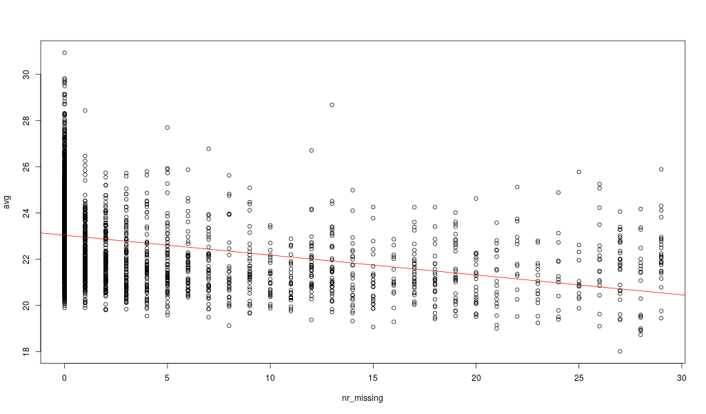
Here, the missing values are not randomly distributed but more likely for low intensity peptides: the average peptide intensity decreases with increasing number of missing values per peptide. This is actually a known phenomenon for this kind of data.
A possible strategy here would be to impute all zero values with half the minimum of positive values for each peptide (row). (half minimum because the values are not missing at random but rather are overepresented by peptides with an average low intensity)
If they were missing at random, then you could for instance replace these values with the median value of the column (this can be a good idea for categorical columns).
5.3. case 3 : “advanced” imputation
Without going too far down the rabbit hole, know that there exists a flurry of methods to perform imputation which actually rely on Machine Learning methods (for instance, using the K-Nearest Neighbors algorithm, or DeepLearning).
These methods are quite fascinating, however if you plan on then using this imputed data for more Machine Learning, you should be wary of not unwittingly commiting leakage (more on that later), influencing too much your results with previous data (thus only reinforcing known knowledge), or introducing a spurious signal in your data.
In any case:
- always have a clear goal in mind when performing any kind of missing value handling
- test and evaluate how different handling methods influence your results
- knowledge of your data is key
6. Normalizing your data
Let’s get back to the cancer dataset.

Note that the features have widely varying centers and scales (means and standard deviations), so we’ll want to center and scale them in some situations. Specifically all methods that rely on any concept of distance among points can be affected: PCA, linear regression, KNN, K-Means, hirarchical clustering, … (ie. most of what we will see during this course). There, failing to take appropriate measure to account for these difference in scale between variable can have dramatic effects. If you will, this is a bit like comparing apples and oranges.
We will use the caret package for this, and specifically, the preProcess function.
The preProcess function can be used for many operations on predictors, including centering and scaling. The function preProcess estimates the required parameters for each operation and predict.preProcess is used to apply them to specific data sets. This function can also be interfaced when calling the train function.
library(caret)

# Center & scale data
ppv <- preProcess(breastCancerDataNoID, method = c("center", "scale"))
breastCancerDataNoID_tr <- predict(ppv, breastCancerDataNoID)
Let’s have a look on the impact of this process by viewing the summary of the first 5 variables before and after the process:
# Summarize first 5 columns of the original data
breastCancerDataNoID[1:5] %>% summary()
The resulting summary should look like this:
Diagnosis  Radius.Mean      Texture.Mean   Perimeter.Mean     Area.Mean
B:357     Min.   : 6.981   Min.   : 9.71   Min.   : 43.79   Min.   : 143.5
M:212     1st Qu.:11.700   1st Qu.:16.17   1st Qu.: 75.17   1st Qu.: 420.3
          Median :13.370   Median :18.84   Median : 86.24   Median : 551.1
          Mean   :14.127   Mean   :19.29   Mean   : 91.97   Mean   : 654.9
          3rd Qu.:15.780   3rd Qu.:21.80   3rd Qu.:104.10   3rd Qu.: 782.7
          Max.   :28.110   Max.   :39.28   Max.   :188.50   Max.   :2501.0
Let’s check the summary of the re-centered and scaled data
# Summarize first 5 columns of the re-centered and scaled data
breastCancerDataNoID_tr[1:5] %>% summary()
It now should look like this:
Diagnosis  Radius.Mean       Texture.Mean     Perimeter.Mean      Area.Mean
B:357     Min.   :-2.0279   Min.   :-2.2273   Min.   :-1.9828   Min.   :-1.4532
M:212     1st Qu.:-0.6888   1st Qu.:-0.7253   1st Qu.:-0.6913   1st Qu.:-0.6666
          Median :-0.2149   Median :-0.1045   Median :-0.2358   Median :-0.2949
          Mean   : 0.0000   Mean   : 0.0000   Mean   : 0.0000   Mean   : 0.0000
          3rd Qu.: 0.4690   3rd Qu.: 0.5837   3rd Qu.: 0.4992   3rd Qu.: 0.3632
          Max.   : 3.9678   Max.   : 4.6478   Max.   : 3.9726   Max.   : 5.2459
As, we can observe here, all variables in our new data have a mean of 0 while maintaining the same distribution of the values. However, this also means that the absolute values do not correspond to the “real”, original data - and is just a representation of them.
We can also check whether our plot has changed with the new data:
library(GGally)

ggpairs(breastCancerDataNoID_tr[1:5], aes(color=Diagnosis, alpha=0.4))
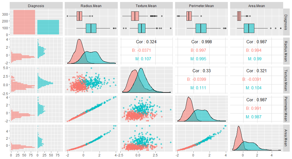
Question: Do you see any differences?
7. Dimensionality Reduction - PCA
Dimensionality reduction serves two puposes
- Visualization: reducing the number of dimensions to 2 or 3 allows displaying the whole dataset for visual inspection
- Data compression: some features may be little informative and projecting feature vectors to the principal data manifold allows discarding the uninformative part of the feature space
In the UCI dataset, for example, there are too many features to keep track of. What if we could reduce the number of features yet still keep much of the information?
Already intuitively, we have seen that there was some variables that are highly correlated.
library( reshape2 )

reorder_cormat <- function(cormat){

dd <- as.dist((1-cormat)/2)
hc <- hclust(dd)
cormat <-cormat[hc$order, hc$order]
}

melted_cormat = melt( reorder_cormat( round(cor( breastCancerDataNoID[2:ncol(breastCancerDataNoID)] ),2 ) ) )

g = ggplot(data = melted_cormat, aes(x=Var1, y=Var2, fill=value)) +
  geom_tile() +
  geom_text(aes(Var2, Var1, label = value), color = "black", size = 2) +
  scale_fill_gradient2(low = "blue", high = "red", mid = "white", midpoint = 0, limit = c(-1,1), space = "Lab",
  name="Pearson\nCorrelation") +
  theme(axis.text.x = element_text(angle = 45, vjust = 1, size = 12, hjust = 1))
g
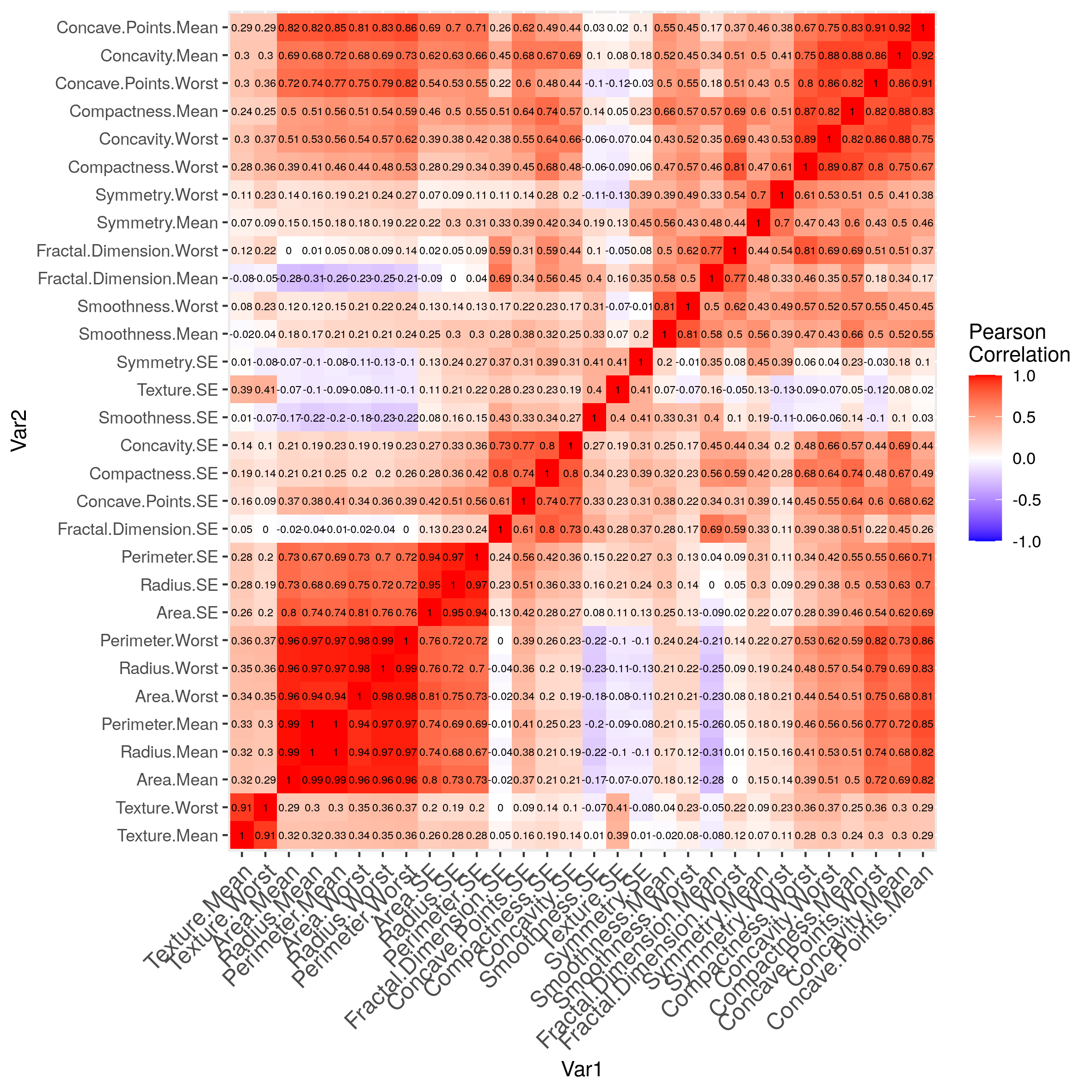
It would be tempting to remove all but 1 variable in the groups where the correlations are very high, or to combine them together.
Principal component analysis (PCA) is one of the most commonly used methods of dimensionality reduction, and finds the direction(s) in feature space with the largest variance (first principal component(s)), meaning the direction(s) where the data points are most spread out.
What PCA essentially does is the following:
- The first step of PCA is to decorrelate your data and this corresponds to a linear transformation of the vector space your data lie in;
- The second step is the actual dimension reduction; what is really happening is that your decorrelation step (the first step above) transforms the features into new and uncorrelated features; this second step then chooses the features that contain most of the information about the data.
Mathematically this boils down to the eigenvalue decomposition or diagonalization of the covariance matrix, where the eigenvalue is the variance of the data along its eigenvector (principal component).
The output of such a process is a set of eigenvectors or PCs (which are a linear combination of your former features) and the variance corresponding to each eigenvector (eigenvalues).
Principal Components are the underlying structure in the data. They are the directions where there is the most variance, the directions where the data is most spread out. This means that we try to find the straight line that best spreads the data out when it is projected along it. This is the first principal component, the straight line that shows the most substantial variance in the data.
PCA is a type of linear transformation on a given data set that has values for a certain number of variables (coordinates) for a certain amount of spaces. In this way, you transform a set of x correlated variables over y samples to a set of p uncorrelated principal components over the same samples.
Where many variables correlate with one another, they will all contribute strongly to the same principal component. Where your initial variables are strongly correlated with one another, you will be able to approximate most of the complexity in your dataset with just a few principal components. As you add more principal components, you summarize more and more of the original dataset. Adding additional components makes your estimate of the total dataset more accurate, but also more unwieldy.
Let’s have a look into the variables that we currently have, and apply PCA to them. As you can see, we will be using only the numerical variables (i.e. we will exclude the first two, ID and Diagnosis):
We can use prcomp to perform our PCA and then use the summary() function to get a summary of the PCA:
pca1 <- prcomp(breastCancerData[3:ncol(breastCancerData)])
summary(pca1)
Importance of components:
                           PC1      PC2      PC3     PC4     PC5     PC6   PC7    PC8    PC9   PC10   PC11    PC12    PC13    PC14    PC15   PC16    PC17    PC18    PC19    PC20     PC21    PC22
Standard deviation     666.170 85.49912 26.52987 7.39248 6.31585 1.73337 1.347 0.6095 0.3944 0.2899 0.1778 0.08659 0.05623 0.04649 0.03642 0.0253 0.01936 0.01534 0.01359 0.01281 0.008838 0.00759
Proportion of Variance   0.982  0.01618  0.00156 0.00012 0.00009 0.00001 0.000 0.0000 0.0000 0.0000 0.0000 0.00000 0.00000 0.00000 0.00000 0.0000 0.00000 0.00000 0.00000 0.00000 0.000000 0.00000
Cumulative Proportion    0.982  0.99822  0.99978 0.99990 0.99999 0.99999 1.000 1.0000 1.0000 1.0000 1.0000 1.00000 1.00000 1.00000 1.00000 1.0000 1.00000 1.00000 1.00000 1.00000 1.000000 1.00000
                           PC23     PC24     PC25     PC26     PC27     PC28     PC29      PC30
Standard deviation     0.005909 0.005329 0.004018 0.003534 0.001918 0.001688 0.001416 0.0008379
Proportion of Variance 0.000000 0.000000 0.000000 0.000000 0.000000 0.000000 0.000000 0.0000000
Cumulative Proportion  1.000000 1.000000 1.000000 1.000000 1.000000 1.000000 1.000000 1.0000000

You can see that the first component explains ~98% of the variance in our data. So according to this, our data was actually almost 1-dimensional!
our PCA object has a number of elements:
$sdev: variance explained by each component$rotation: The relationship (correlation or anticorrelation, etc) between the initial variables and the principal components- The center point (
$center), scaling ($scale) and the $x: the values of each sample in terms of the principal components
Let’s look at the composition of this first component which seems so important:
o = order( abs( pca1$rotation[,1] ) , decreasing=TRUE )
pca1$rotation[o[1:5],1] # focus on the 5 top elements
     Area.Worst       Area.Mean         Area.SE Perimeter.Worst  Perimeter.Mean
    -0.85206339     -0.51682647     -0.05572717     -0.04945764     -0.03507633
Anything after that contributes less to the component.
So, it would appear that this component, which recapitulates ~98% of the variance, is composed, overwhelmingly, of 2 variables related to cell area…
Question: Stop. Think. What does this imply? Is this normal? Did we forget something?
Hint:
par(mar=c(5.1,10.6,4.1,2.1))
barplot( colMeans( breastCancerData[3:ncol(breastCancerData)] ) ,
         xlab='column mean',las=2 , horiz=TRUE)
Extra Question: **If you have an idea what went wrong, try to do the right thing. Put the resulting pca object in ppv_pca **
Don’t peek.
Let’s see what happen when we actually take care of the difference in scale between our variables by normalizing:
ppv_pca <- prcomp(breastCancerData[3:ncol(breastCancerData)] , center=TRUE , scale. =TRUE)
summary(ppv_pca)
Importance of components:
                          PC1    PC2     PC3     PC4     PC5     PC6     PC7     PC8    PC9
Standard deviation     3.6444 2.3857 1.67867 1.40735 1.28403 1.09880 0.82172 0.69037 0.6457
Proportion of Variance 0.4427 0.1897 0.09393 0.06602 0.05496 0.04025 0.02251 0.01589 0.0139
Cumulative Proportion  0.4427 0.6324 0.72636 0.79239 0.84734 0.88759 0.91010 0.92598 0.9399
                          PC10   PC11    PC12    PC13    PC14    PC15    PC16    PC17
Standard deviation     0.59219 0.5421 0.51104 0.49128 0.39624 0.30681 0.28260 0.24372
Proportion of Variance 0.01169 0.0098 0.00871 0.00805 0.00523 0.00314 0.00266 0.00198
Cumulative Proportion  0.95157 0.9614 0.97007 0.97812 0.98335 0.98649 0.98915 0.99113
                          PC18    PC19    PC20   PC21    PC22    PC23   PC24    PC25    PC26
Standard deviation     0.22939 0.22244 0.17652 0.1731 0.16565 0.15602 0.1344 0.12442 0.09043
Proportion of Variance 0.00175 0.00165 0.00104 0.0010 0.00091 0.00081 0.0006 0.00052 0.00027
Cumulative Proportion  0.99288 0.99453 0.99557 0.9966 0.99749 0.99830 0.9989 0.99942 0.99969
                          PC27    PC28    PC29    PC30
Standard deviation     0.08307 0.03987 0.02736 0.01153
Proportion of Variance 0.00023 0.00005 0.00002 0.00000
Cumulative Proportion  0.99992 0.99997 1.00000 1.00000
This is much more reasonnable than before.
In our case, we had 30 variables (32 original, minus the first two), so we have produced 30 eigenvectors / PCs. And we can see that we can address more than 95% of the variance (0.95157) using only the first 10 PCs.
Let’s try to visualize the results we’ve got so far. We will be using the ggbiplot library for this purpose.
library(ggbiplot)
ggbiplot(ppv_pca, choices=c(1, 2),
         labels=rownames(breastCancerData),
         ellipse=TRUE,
         groups = breastCancerData$Diagnosis,
         obs.scale = 1,
         var.axes=TRUE, var.scale = 1) +
  ggtitle("PCA of Breast Cancer Dataset")+
  theme_minimal()+
  theme(legend.position = "bottom")
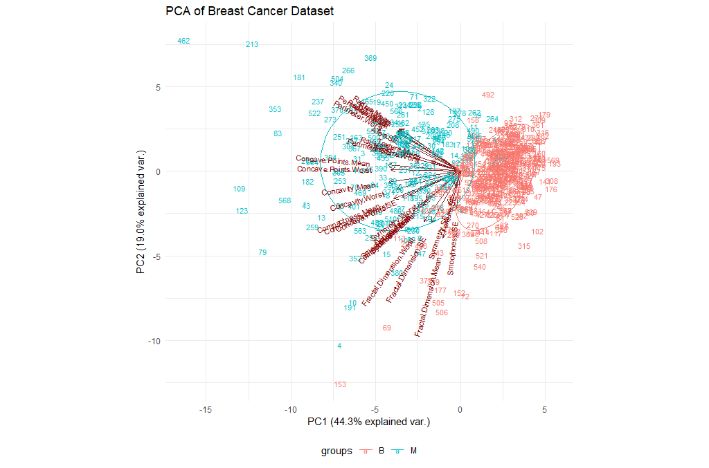
| Exercises | |
|---|---|
| 1 | Try changing the parameters of the plot. In particular, check the choices. |
| 2 | We have been using the entire table of data. What if we restrict our analysis on the mean values (i.e. columns 3-12)? Is there an impact? |
Extra Exercise perform a PCA on the Phospho dataset.