Supervised Learning II: regression
library(tidyverse)
breastCancerData <- read_csv("https://archive.ics.uci.edu/ml/machine-learning-databases/breast-cancer-wisconsin/wdbc.data",
                             col_names = FALSE)
breastCancerDataColNames <- read_csv("https://raw.githubusercontent.com/BiodataAnalysisGroup/2021-11-ml-elixir-pt/main/data/wdbc.colnames.csv",
                                     col_names = FALSE)
colnames(breastCancerData) <- breastCancerDataColNames$X1

breastCancerData$Diagnosis = as.factor(breastCancerData$Diagnosis)

# Check out head of dataframe
breastCancerData %>% head()
Linear regression
Linear regression is to predict response with a linear function of predictors. The most common function in R for this is lm. In our dataset, let’s try to investigate the relationship between Radius.Mean, Concave.Points.Mean and Area.Mean. We can get a first impression by looking at the correlation of these variables:
## correlation between Radius.Mean and Concave.Points.Mean / Area.Mean
cor(breastCancerData$Radius.Mean, breastCancerData$Concave.Points.Mean)
## [1] 0.8225285
cor(breastCancerData$Concave.Points.Mean, breastCancerData$Area.Mean)
## [1] 0.8232689
Lets create a short version of our data
bc <- select(breastCancerData,Radius.Mean,Concave.Points.Mean,Area.Mean)
Let’s build now a linear regression model with function lm() on the whole dataset:
bc_model_full <- lm(Radius.Mean ~ Concave.Points.Mean + Area.Mean, data=bc)
bc_model_full
The output is the following:
Call:
lm(formula = Radius.Mean ~ ., data = bc)

Coefficients:
        (Intercept)  Concave.Points.Mean            Area.Mean
            7.68087              2.72493              0.00964
This tells us what are the coefficients of Concave.Points.Mean and Area.Mean, in the linear equation that connects them to Radius.Mean. Let’s see if we can predict now the mean radius of a new sample, with Concave.Points.Mean = 2.724931 and Area.Mean = 0.00964.
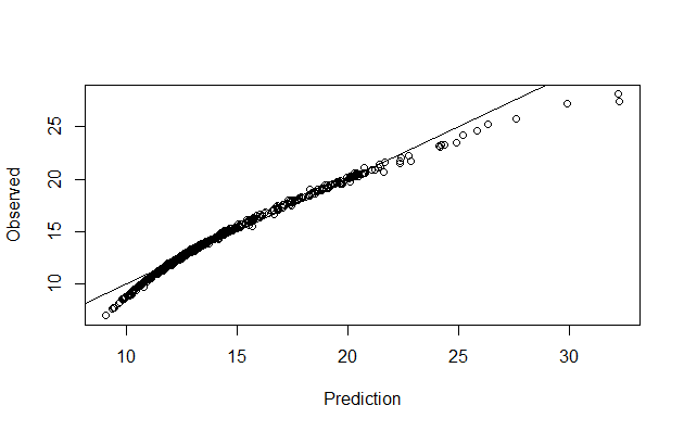
Let’s make predictions on our training dataset and visualize
preds <- predict(bc_model_full)

plot(preds, bc$Radius.Mean, xlab = "Prediction", ylab = "Observed")
abline(a = 0, b = 1)

We can also have a better look at what the model contains with summary(bc_model_full):
Call:
lm(formula = Radius.Mean ~ ., data = bc)

Residuals:
    Min      1Q  Median      3Q     Max
-4.8307 -0.1827  0.1497  0.3608  0.7411

Coefficients:
                     Estimate Std. Error t value Pr(>|t|)
(Intercept)         7.6808702  0.0505533 151.936   <2e-16 ***
Concave.Points.Mean 2.7249328  1.0598070   2.571   0.0104 *
Area.Mean           0.0096400  0.0001169  82.494   <2e-16 ***
---
Signif. codes:  0 ‘***’ 0.001 ‘**’ 0.01 ‘*’ 0.05 ‘.’ 0.1 ‘ ’ 1

Residual standard error: 0.5563 on 566 degrees of freedom
Multiple R-squared:  0.9752,	Adjusted R-squared:  0.9751
F-statistic: 1.111e+04 on 2 and 566 DF,  p-value: < 2.2e-16
But his only provides the evaluation on the whole dataset that we sued for training. we don’t know how it will perform on unknown dataset. So, let’s split our dataset into training and test set, create the model on training set and visualize the predictions
set.seed(123)
ind <- sample(2, nrow(bc), replace=TRUE, prob=c(0.75, 0.25))
bc_train <- bc[ind==1,]
bc_test <- bc[ind==2,]


#Let's build now a linear regression model using the training data and print it:
(bc_model <- lm(Radius.Mean ~ Concave.Points.Mean + Area.Mean, data=bc_train))

#We can also view the model's summary
summary(bc_model)


######Evaluating graphically
#Let's make predictions on our training dataset and store the predictions as a new column
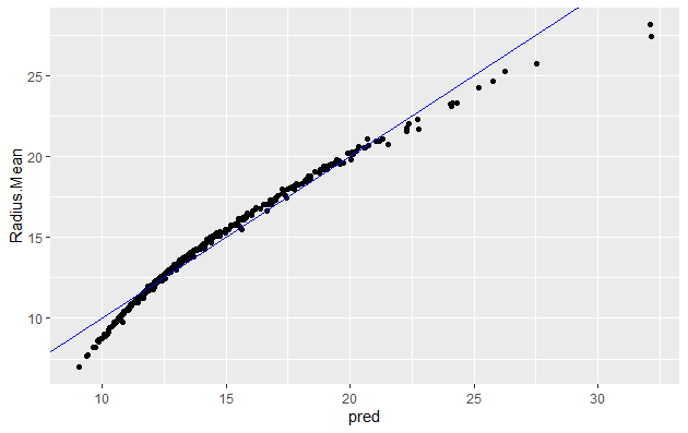
bc_train$pred <- predict(bc_model)

# plot the ground truths vs predictions for training set
ggplot(bc_train, aes(x = pred, y = Radius.Mean)) +
  geom_point() +
  geom_abline(color = "blue")

You will note that it is quite similar to when using whole dataset
Let’s predict using test data:
bc_test$pred <- predict(bc_model , newdata=bc_test)

# plot the ground truths vs predictions for test set and examine the plot. Does it look as good with the predictions on the training set?
ggplot(bc_test, aes(x = pred, y = Radius.Mean)) +
  geom_point() +
  geom_abline(color = "blue")
Now let’s use the RMSE and the R_square metrics to evaluate our model on the training and test set.
1. Evaluating model using RMSE - on training set
# Calculate residuals
res <- bc_train$Radius.Mean-bc_train$pred
#For training data we can also obtain the residuals using the bc_model$residuals

# Calculate RMSE, assign it to the variable rmse and print it
(rmse <- sqrt(mean(res^2)))
[1] 0.5624438

# Calculate the standard deviation of actual outcome and print it
(sd_bc_train <- sd(bc_train$Radius.Mean))
[1] 3.494182
So we can see that our RMSE is very small compared to SD, hence it is a good model
| Exercises | |
|---|---|
| 1 | Calculate RMSE for the test data and check if the model is not overfit. |
2. Evaluating model using R Square - on training set
# Calculate mean of outcome: bc_mean. Print it
bc_mean <- mean(bc_train$Radius.Mean)

# Calculate total sum of squares: tss. Print it
tss <- sum((bc_train$Radius.Mean - bc_mean)^2)

# Calculate residual sum of squares: rss. Print it
err <- bc_train$Radius.Mean-bc_train$pred
rss <- sum(err^2)

# Calculate R-squared: rsq. Print it. Is it a good fit?
(rsq <- 1-(rss/tss))
[1] 0.974028
This again confirms that our model is very good as the R_Square value is very close to 1
| Exercises | |
|---|---|
| 1 | Calculate R_Square for the test data and check if the model is not overfit. |
3. Avoid leakage and overfitting : caret for your cross-validation procedure
library(caret)
# Set up a 10-fold cross validation
tc <- trainControl(method = "cv", number = 10)

# Include the setup in your model
lm1_cv <- train(Radius.Mean~Concave.Points.Mean+Area.Mean,
             data = bc_train,
             method = "lm",
             preProcess = c('center', 'scale'),
             trControl = tc) # here
lm1_cv
Random Forest for regression
library(caret)
# Set up a 10-fold cross validation
tc <- trainControl(method = "cv", number = 10)

# Include the setup in your model
rf1_cv <- train(Radius.Mean~Concave.Points.Mean+Area.Mean,
             data = bc_train,
             method = "rf",
             preProcess = c('center', 'scale'),
             trControl = tc) # here
rf1_cv
Generalized Linear Model (GLM)
GLM, as the name implies, generalizes linear regression by allowing the linear model to be related to the response variable via a link function and allowing the magnitude of the variance of each measurement to be a function of its predicted value. It unifies various other statistical models, including linear regression, logistic regression and Poisson regression. The corresponding function is glm(); it fits generalized linear models, specified by giving a symbolic description of the linear predictor and a description of the error distribution.
We will perform Linear Regression using GLM with family =Gaussian. GLM with the log link function we are modeling the linear regression as ln(f(y)). type for response indicates the type of prediction required. The default is on the scale of the linear predictors, and the alternative “response” is on the scale of the response variable.
And we will do visualization and calculate RMSE adn RSquare for the training data after generating our model and compare the results for linear regression we got above.
myFormula <-Radius.Mean ~ Concave.Points.Mean + Area.Mean
bc_model2 <-glm(myFormula, family=gaussian("log"),data=bc_train)

summary(bc_model2)
The output is the following:
Call:
glm(formula = myFormula, family = gaussian("log"), data = bc_train)

Deviance Residuals:
    Min       1Q   Median       3Q      Max
-8.8018  -0.5850   0.1779   0.7005   1.8351

Coefficients:
                     Estimate Std. Error t value Pr(>|t|)
(Intercept)         2.285e+00  7.747e-03  294.89  < 2e-16 ***
Concave.Points.Mean 8.571e-01  1.517e-01    5.65 2.98e-08 ***
Area.Mean           4.639e-04  1.476e-05   31.44  < 2e-16 ***
---
Signif. codes:  0 ‘***’ 0.001 ‘**’ 0.01 ‘*’ 0.05 ‘.’ 0.1 ‘ ’ 1

(Dispersion parameter for gaussian family taken to be 1.303883)

    Null deviance: 5103.49  on 418  degrees of freedom
Residual deviance:  542.41  on 416  degrees of freedom
AIC: 1305.2

Number of Fisher Scoring iterations: 6
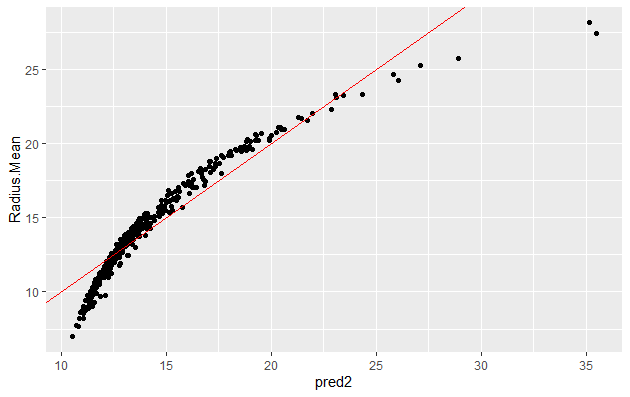
We can now make prediction and visualize the result:
bc_train$pred2 <-predict(bc_model2,type = "response")

ggplot(bc_train, aes(x = pred2, y = Radius.Mean)) +
  geom_point() +
  geom_abline(color = "blue")


######RMSE
res <- bc_train$Radius.Mean-bc_train$pred2

(rmse <- sqrt(mean(res^2)))
[1] 1.137781

# Calculate the standard deviation of actual outcome and print it
(sd_bc_train <- sd(bc_train$Radius.Mean))
[1] 3.494182

######R_Sq
# Calculate mean of outcome: bc_mean.
bc_mean <- mean(bc_train$Radius.Mean)

# Calculate total sum of squares: tss
tss <- sum((bc_train$Radius.Mean - bc_mean)^2)

# Calculate residual sum of squares: rss.
err <- bc_train$Radius.Mean-bc_train$pred2
rss <- sum(err^2)

# Calculate R-squared: rsq. Print it. Is it a good fit?
(rsq <- 1-(rss/tss))
[1] 0.8937169
The plot, the value of RMSE (higher than in linear regression) and RSquare (lower than that for linear regression) indicates that this model is not as good as linear regression.

note : R-squared is not the best metric for non linear models.
Here is an example on how to use a GLM with caret
| Exercises | |
|---|---|
| 1 | Try working with additional columns as targets for the regression. |